The Anatomy of a High-Converting BJJ Website: Turning Visitors into Students
In the digital world, your website is often the very first interaction a potential student has with your academy. Before they shake your hand, smell the mats, or see a technique, they judge you by your URL. Most Brazilian Jiu-Jitsu academies treat their website like a digital business card—a static page with a logo, an address, and a blurry photo of the professor. This is a massive missed opportunity.
In 2026, a website must be more than just “pretty.” It must be a conversion machine. A high-converting website is designed with a single purpose: to take a stranger and turn them into a scheduled appointment. It works while you sleep. It answers questions while you train. It sells your culture while you spend time with your family.
If you are spending money on Ads or SEO but sending that traffic to a mediocre website, you are burning cash. This article dissects exactly what makes a BJJ website convert and how Equipe ADS builds digital platforms that act as your best salesperson.
Become a black belt in marketing.
The Difference Between Design and Conversion
Many gym owners hire a local graphic designer to build their site. The result is often visually “cool”—lots of dark colors, complex animations, and samurai fonts. But “cool” does not always mean “profitable.”
The “Granny Test” vs. The “Cool Factor”
A high-converting website prioritizes clarity over cleverness. If a grandmother lands on your site, can she figure out within 3 seconds:
Where you are?
What you teach?
How to sign her grandson up?
If the answer is “no,” you are losing leads. Conversion design uses clean lines, readable fonts, and obvious buttons. It removes friction. It guides the eye to the most important action: booking a trial.
1. Speed is the New Currency
Human attention spans are shorter than ever. If your website takes more than 3 seconds to load on a smartphone, 53% of visitors will leave before seeing a single word.
Google Penalizes Slow Sites
Speed isn’t just about user patience; it is about visibility. Google actively ranks slow websites lower. At Equipe ADS, we optimize every image and line of code. We ensure your digital dojo loads instantly, even on a slow 4G connection. This “Technical SEO” ensures that the traffic you worked hard to get actually stays on the page.
2. Mobile-First Architecture
Look around a waiting room, a bus stop, or a coffee shop. Everyone is on their phone. Over 85% of traffic to martial arts websites comes from mobile devices.
The “Thumb Zone”
A site that looks great on a laptop might be a disaster on an iPhone.
Are the buttons large enough to tap with a thumb?
Is the text large enough to read without zooming?
Does the menu work smoothly?
We design for the phone first, and the desktop second. This ensures that the majority of your users have a seamless experience, removing the frustration that kills conversion.
3. The Power of “Social Proof”
In Jiu-Jitsu, trust is everything. A beginner is intimidated. They are worried about getting hurt. They are worried about “meatheads.” Your website must dismantle these fears instantly using Social Proof.
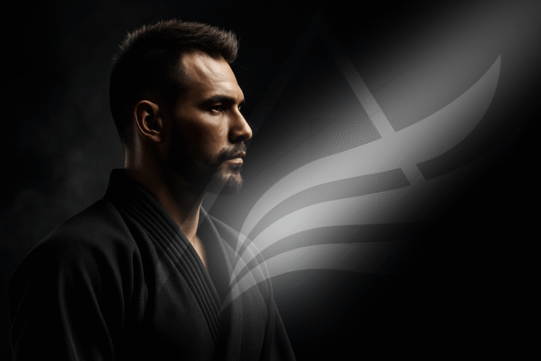
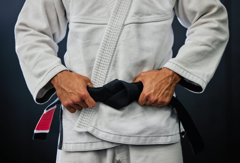
Authentic Imagery Over Stock Photos
Stock photos of karate models in pristine white gis look fake. They lower trust. A high-converting site uses high-quality, authentic photos of your students. Show smiling faces. Show women training. Show kids having fun. This proves that your gym is a safe, welcoming community.
Video Testimonials
Text reviews are good; video reviews are gold. A 30-second video of a mother talking about how BJJ improved her son’s focus is more powerful than any sales copy you could write. We strategically place these “trust signals” next to the “Sign Up” buttons to reassure the prospect at the moment of decision.
4. The “Call to Action” (CTA) Strategy
A passive website waits for the user to decide. A high-converting website tells the user what to do.
Clear and Direct Instructions
Do not use vague buttons like “Submit” or “Contact.” Use action-oriented language that conveys value.
Bad: “More Info”
Good: “Claim Your Free Week”
Good: “Start Your Transformation”
These buttons should be a contrasting color (like bright red or neon green) and placed strategically throughout the page. The user should never have to scroll far to find a way to pay you.
5. The “Above the Fold” Rule
“Above the fold” refers to the part of the website you see before you start scrolling. This is the most valuable real estate on the internet.
The Headline Hook
Your main headline must address the prospect’s desire, not just state your name.
Weak Headline: “Gracie Barra Springfield.”
Strong Headline: “Build Confidence and Fitness with Springfield’s #1 Jiu-Jitsu Program.”
Your “Above the Fold” section must contain:
A compelling Headline.
A Sub-headline explaining the benefit.
A primary Call to Action (CTA) button.
A background image or video showing happy students.
If you fail to hook them here, they won’t scroll down to read your history.
6. Eliminating Navigation Bloat
A common mistake is having a menu with 15 different options: “History,” “Lineage,” “Gallery,” “Shop,” “Blog,” “Events,” etc. This is called “Analysis Paralysis.” When you give a user too many choices, they often choose nothing.
The Simplified Funnel
A high-converting site simplifies the navigation. We focus the user on the primary goal: The Schedule and The Trial. We often hide secondary pages in the footer. We want the user to have tunnel vision towards the enrollment form. Less choice leads to higher conversion.
7. The Offer They Can’t Refuse
Your website is the vehicle, but the “Offer” is the fuel. A website that says “Sign up for membership” converts poorly. A website that makes an irresistible offer converts like crazy.
Low Barrier to Entry
You must lower the risk for the prospect.
“6-Week Challenge”
“Free Uniform with First Month”
“3 Classes for $19”
Your website should highlight this offer front and center. It gives the visitor a logical reason to exchange their contact information with you right now rather than later.

Investing in Your Digital Storefront
Your academy’s physical location costs you thousands of dollars a month in rent, cleaning, and maintenance. You pay this because you know a professional facility attracts students.
Become a black belt in marketing.
Your website is your digital facility. If the lights are flickering (slow speed), the mats are dirty (bad design), and the door is locked (no form), you are losing business.
Investing in a high-converting website built by Equipe ADS is not an expense; it is an asset. It captures the interest you work so hard to generate and turns it into revenue.
Is your website working for you, or against you? Contact Equipe ADS for a website conversion audit today.